

The rules were -
we ask that the card stays in this orientation ie that the band remains in the horizontal plane, in the lower part of the card and that it takes up no more than 1/3rd of the height of the cardbase.
One of the problems with LIM is when you look at all the 'wow' creations that people produce every week, yours look just naff!!!
But naff or not am sharing it anyway!!
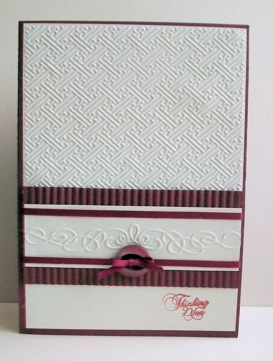
I used cream linen textured card and an embossing folder from the Oriental set I bought a long time ago for the main background.
I also embossed a border die onto the same card.
Crimped some maroon cardstock and put it behind the cream border die, added a bit of maroon ribbon to define the flourish and finished with a button from my stash.
Matted it all onto maroon cardstock.
The pic is not the best either - the light here hasn't been very good since we lost the sunshine at lunchtime - I may have another go at this week's challenge as I've just had another 'light bulb' moment!!
29 comments:
I think we are always our own worst critics - I really like your card. The burgundy rippled paper is smashing and matches your button really well and I LOVE your embossed flourish
Kathyk
Very nice Viv love the dark red and white, very classy
jacqui x
Love that embossed border, very stylish!
Beautifully elegant with great embossing.
Hugs Desíre {Doing Life}
Very elegant
Well I think it is great. So easy to end up with something looking flat unless you use some texture as you have done. Wish I had thought of doing that! Great colour too, its very elegant.
Julia
Hi Viv thank you for your comments last week. I love the embossing on this card and the rippled burgundy paper makes it pop. Angela x
Well I think it is beautiful, wonderful embossing as well.
Yvonne x
Great texture and I love the alternative colour. xx Flora
I adore this Viv - and the rippled burgundy is a fabulous touch, in addition to the other lovely elements. A winner in my eyes!
Hugs, Di xx
Love the classy look of your card with a super design and colour scheme.
Monica xxx
It's not naff, it's nice! But I know what you mean and I feel the same about many of my creations. Love the embossing folder used here and the classy colour combo.
I think you have been far too hard on yourself Viv, your card is stunning! Love the embossed flourish its very elegant! x
There's nothing naff about LiM, and this is a classy example. I love that embossing :o)
Jackie xx
ha ha ha, I know EXACTLY what you mean!! I would have messed it up! I'm not sketch type person neither, quite strange that I'm on the Sketch N Stash DT lol!! But I love your CAS card!
Hugs, Alessandra
Oh! Viv, now i feel totally useless....lol This is Superb and if this is naff then I need to retire and take up golf :o
I love your added colour and embossing.
I am a total loss at LIM but I will try again this week, I started entering again but then had a hectic two weeks so fell behind :(
Huge Hugs Mau xx
so stunning viv.gorgeous classy design and i love your embossing ;D
xx coops xx
I like your card it looks so elegant
and you know, our crafting is not done by computers, or machines it`s done by us
by our hands, and so shall it be
xxxAnnette
Not sure what naff means...but if you're saying that your card isn't as "good" as others posted in the challenge....don't be so hard on yourself!!! Your card is simply gorgeous! I LOVE all of the embossing on your card, and the rippled paper behind the white embossed strip really sets off the white swirl embossing! I LOVE this card...and you should too!
I think you've cracked it - not a sign of naffness anywhere. (I often feel that way about my cards too). X
Well I think it`s a smashing card Viv and not `naff` at all. I love your colours too.
Lynne xxx
This is really pretty. I like all the different textures.
I think this is a lovely card, classy and certainly not naff.xx
Hi Viv! thanks for the snippets suggestion :) I love the variety of textures on your card, very elegant design.
I think your card looks really elegant with lots of gorgeous details whilst still being CAS. x
What wonderful embossing!
I love those folders.
Super card.
Thanks so much
Chrissie
Less is More
Your cards are never naff Viv and this one's gorgeous with all that lovely texture! Vicky x
i love the embossing!!
Thanks for Joining us this week
Jen xx
"Less Is More"
Hi Viv, Well I think it's really classy, clever ol you ;)) the red and white combo works beautifully, Gay xx
Post a Comment